
Notice
Recent Posts
Recent Comments
Link
| 일 | 월 | 화 | 수 | 목 | 금 | 토 |
|---|---|---|---|---|---|---|
| 1 | 2 | 3 | 4 | |||
| 5 | 6 | 7 | 8 | 9 | 10 | 11 |
| 12 | 13 | 14 | 15 | 16 | 17 | 18 |
| 19 | 20 | 21 | 22 | 23 | 24 | 25 |
| 26 | 27 | 28 | 29 | 30 | 31 |
Tags
- css
- 패스트캠퍼스
- 7장오류처리
- es6
- 클린코드
- 디지털기초역량훈련
- 파이썬터틀
- 독후감
- 내일배움카드
- 코딩 #개발자 #노마드북클럽 #노개북
- 5장형식맞추기
- 일본워킹홀리데이계획서
- 일본워킹홀리데이이유서
- flexbox
- JavaScript
- 노개북
- 국비지원
- 일러스트레이터강의
- 중첩된객체
- 플렉스박스
- python
- 자바스크립트
- 9장단위테스트
- 파이썬
- python turtle
- 웹개발자를위한자바스크립트의모든것
- 바이트디그리
- 일본워홀서류
- 디스트럭처링
- 3장함수
Archives
- Today
- Total
KARIU의 IT 블로그
[CSS_Flexbox] Flexbox를 게임으로 배워보자 - Flexbox Froggy 소개 & 정답 본문
반응형
Flexbox Froggy 소개
CSS에서 유용하게 사용할 수 있는 Flexbox!

이를 게임으로 더욱 재미있게 배울 수 있습니다.
Flexbox Froggy라는 게임 사이트인데요. flexbox를 사용하여 개구리들을 옮기는 게임입니다. 물론 무료구요. 한국어로도 이용이 가능하며 설명 또한 자세하게 적혀있어 flexbox를 공부할 때 도움이 많이 되는 사이트입니다.
아래에 링크를 남겨 놨으니 한 번 방문하셔서 즐겨보시길 바랍니다.
Flexbox Froggy
A game for learning CSS flexbox
flexboxfroggy.com
총 24단계로 구성 되어있습니다.
정답도 같이 남기니 필요하신 분들은 참고해주시면 감사하겠습니다.
Flexbox Froggy 정답
빠른 정답이동
- 단계 1
- 단계 2
- 단계 3
- 단계 4
- 단계 5
- 단계 6
- 단계 7
- 단계 8
- 단계 9
- 단계 10
- 단계 11
- 단계 12
- 단계 13
- 단계 14
- 단계 15
- 단계 16
- 단계 17
- 단계 18
- 단계 19
- 단계 20
- 단계 21
- 단계 22
- 단계 23
- 단계 24
단계 1
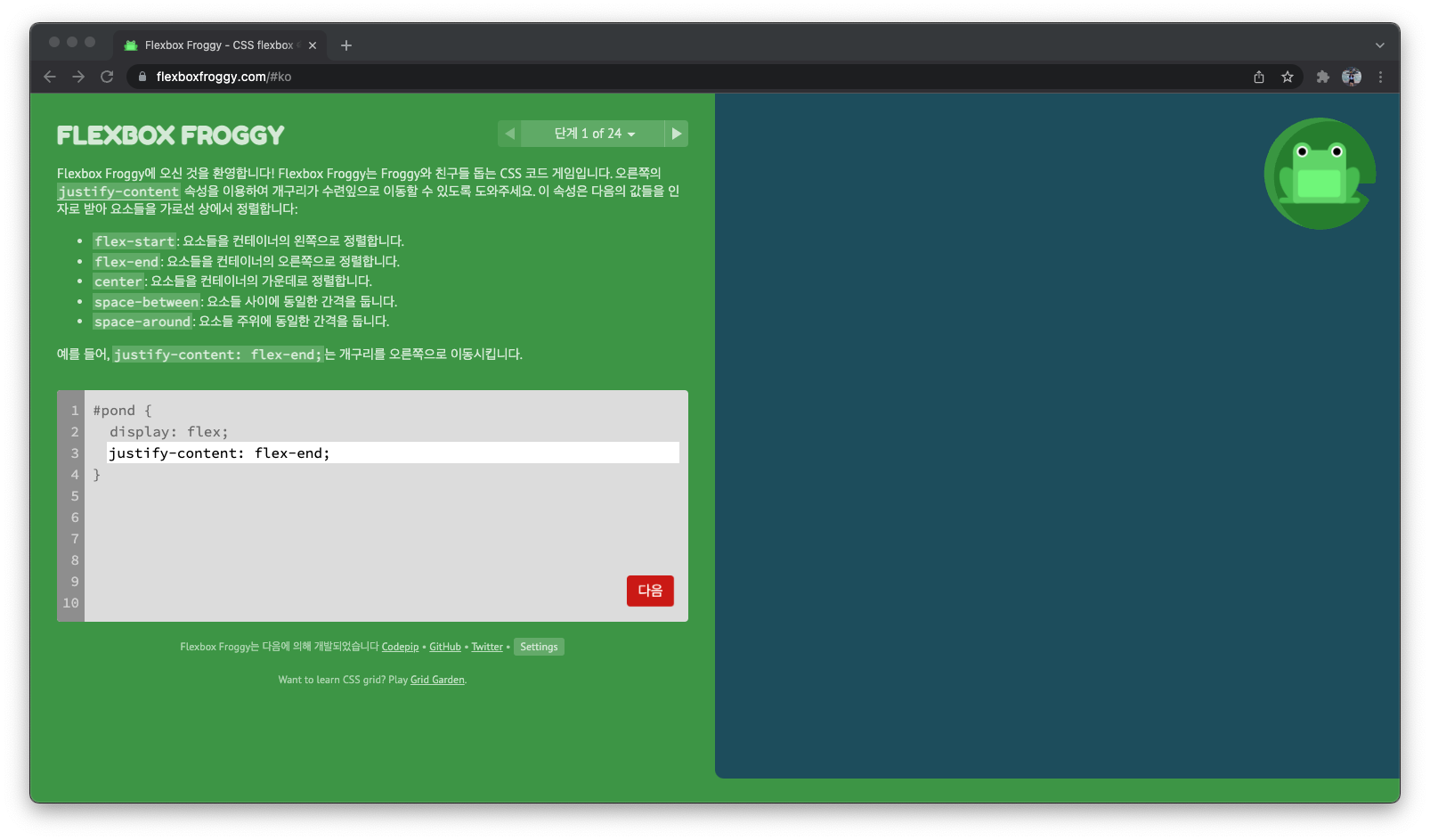
justify-content: flex-end;
단계 2
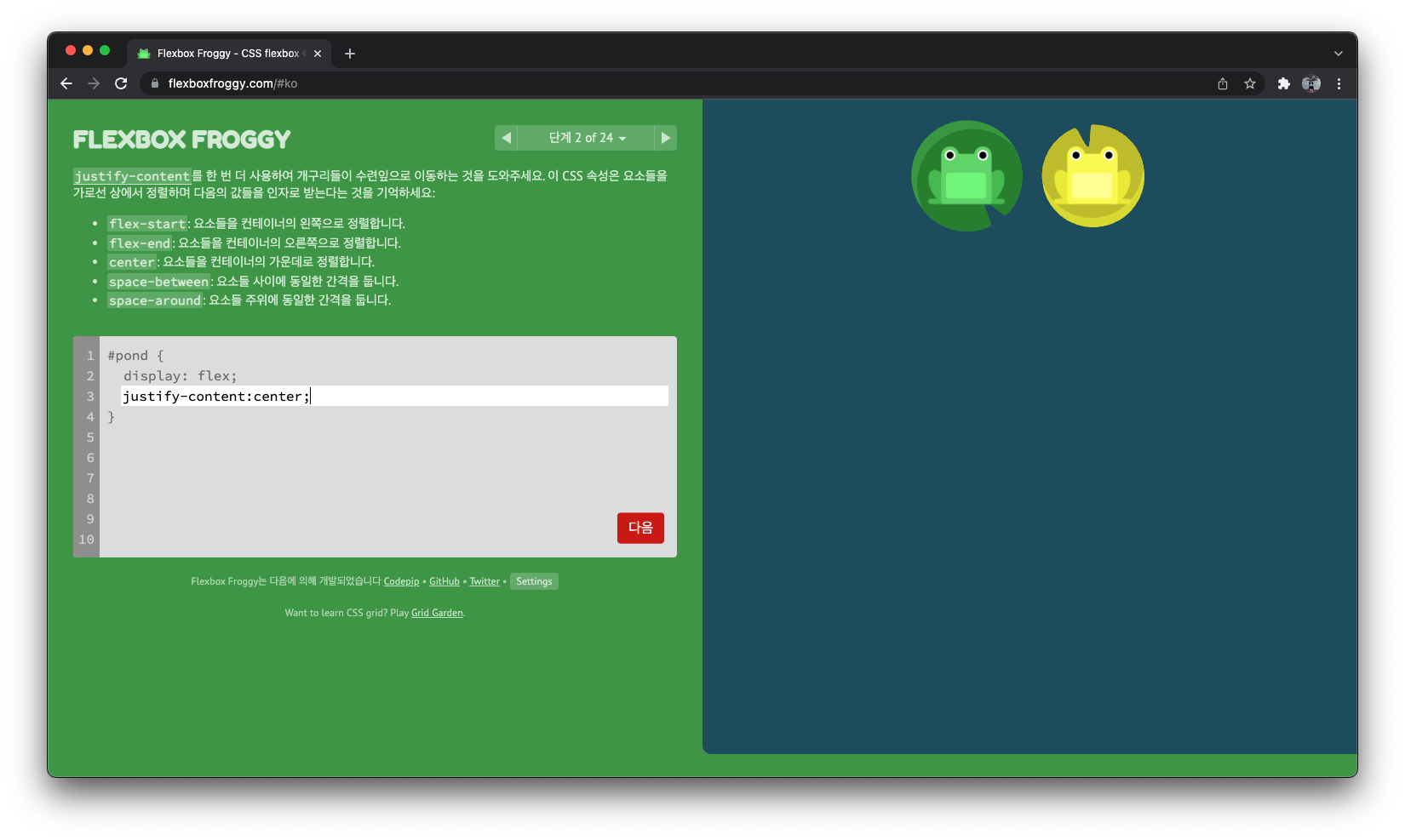
justify-content:center;
단계 3
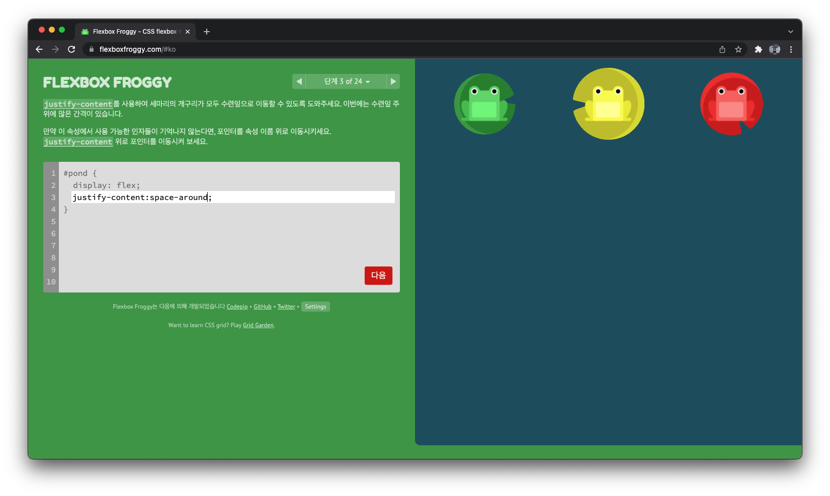
justify-content:space-around;
단계 4
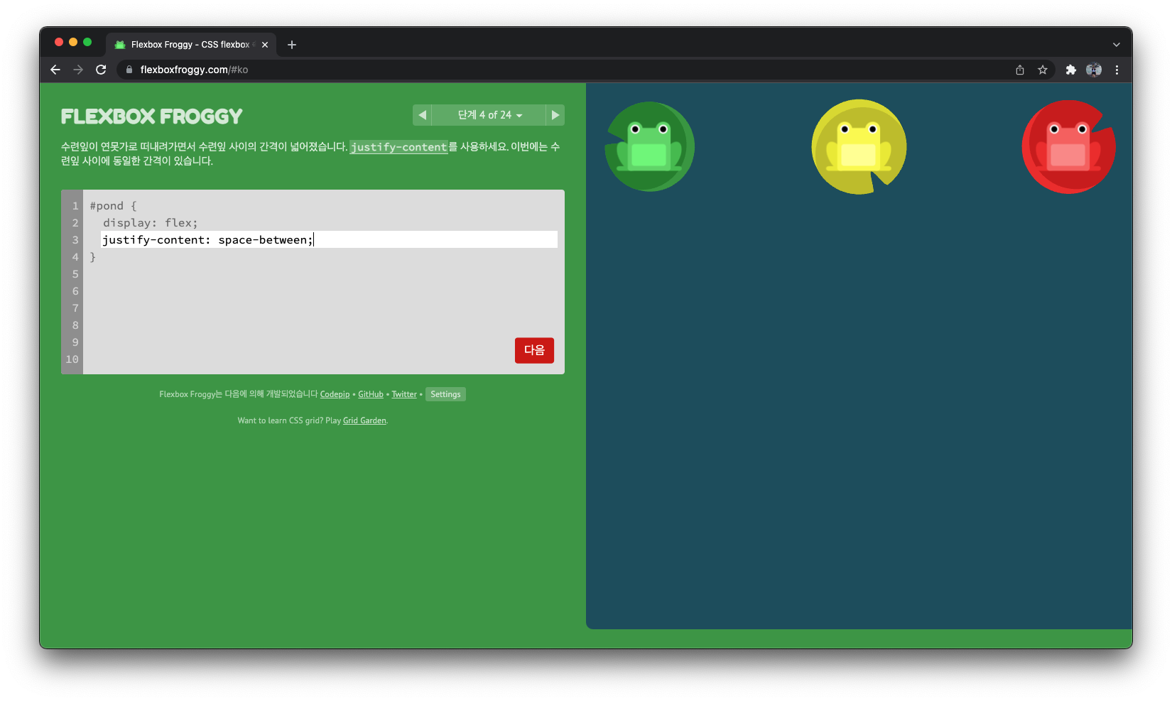
justify-content: space-between;
단계 5

align-items: flex-end;
단계 6
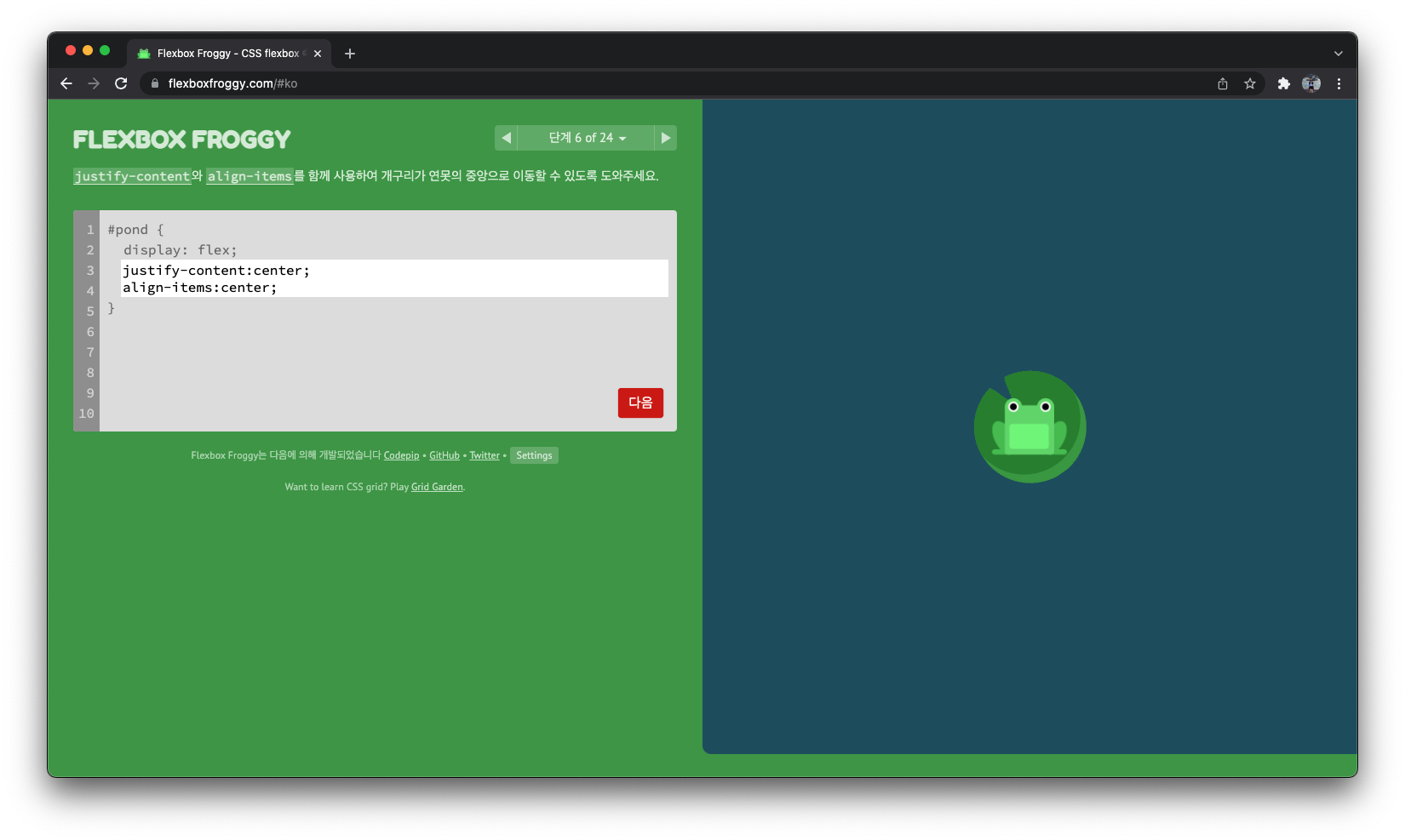
justify-content:center;
align-items:center;
단계 7
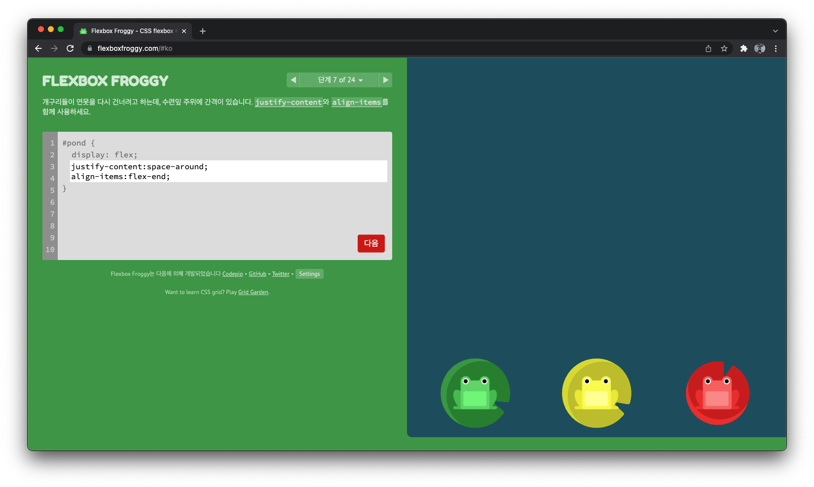
justify-content:space-around;
align-items:flex-end;
단계 8
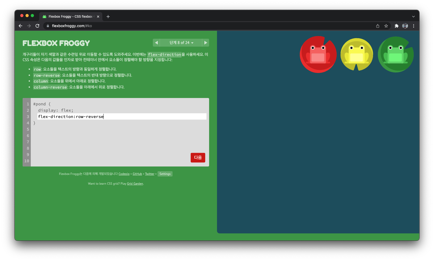
flex-direction:row-reverse
단계 9
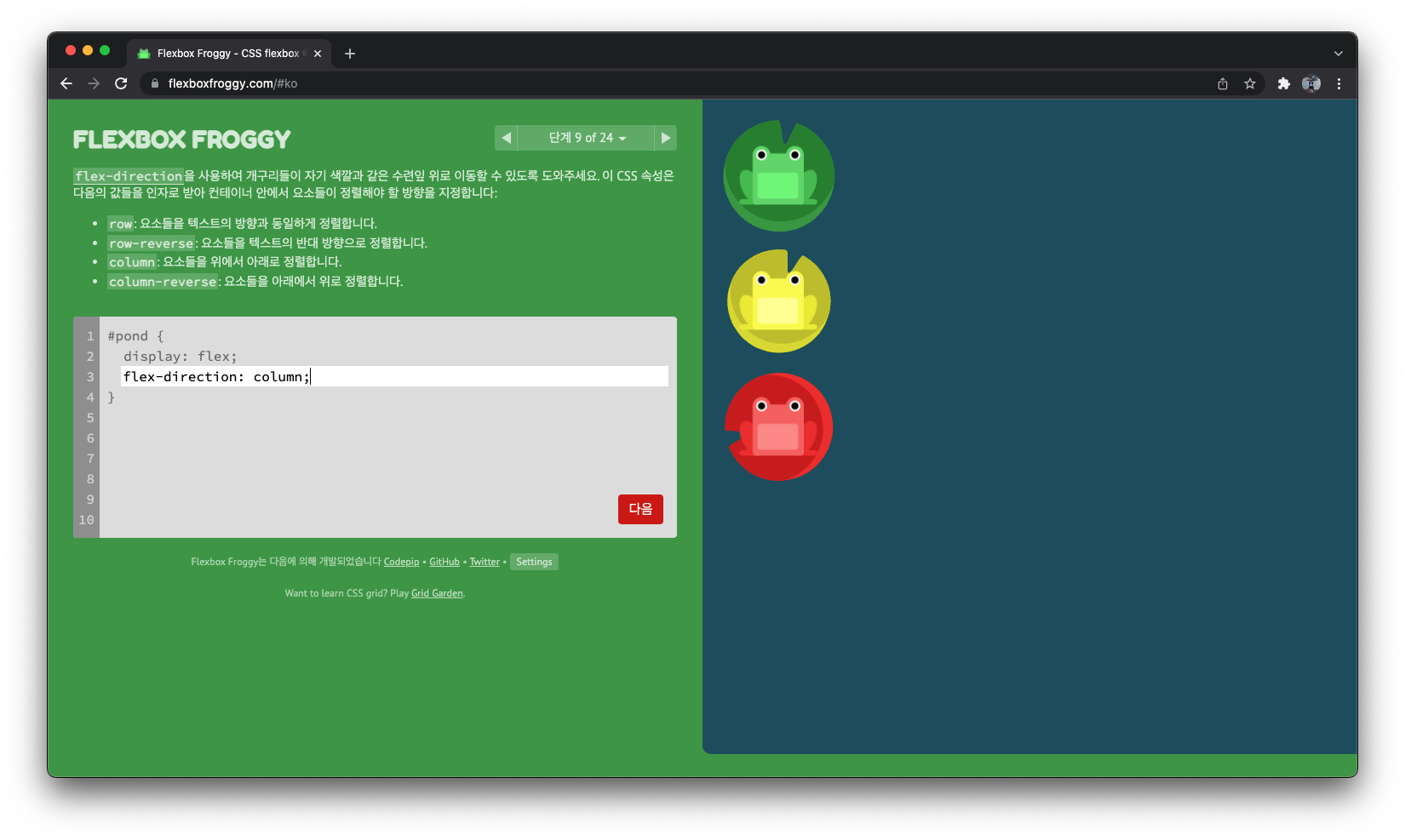
flex-direction: column;
단계 10
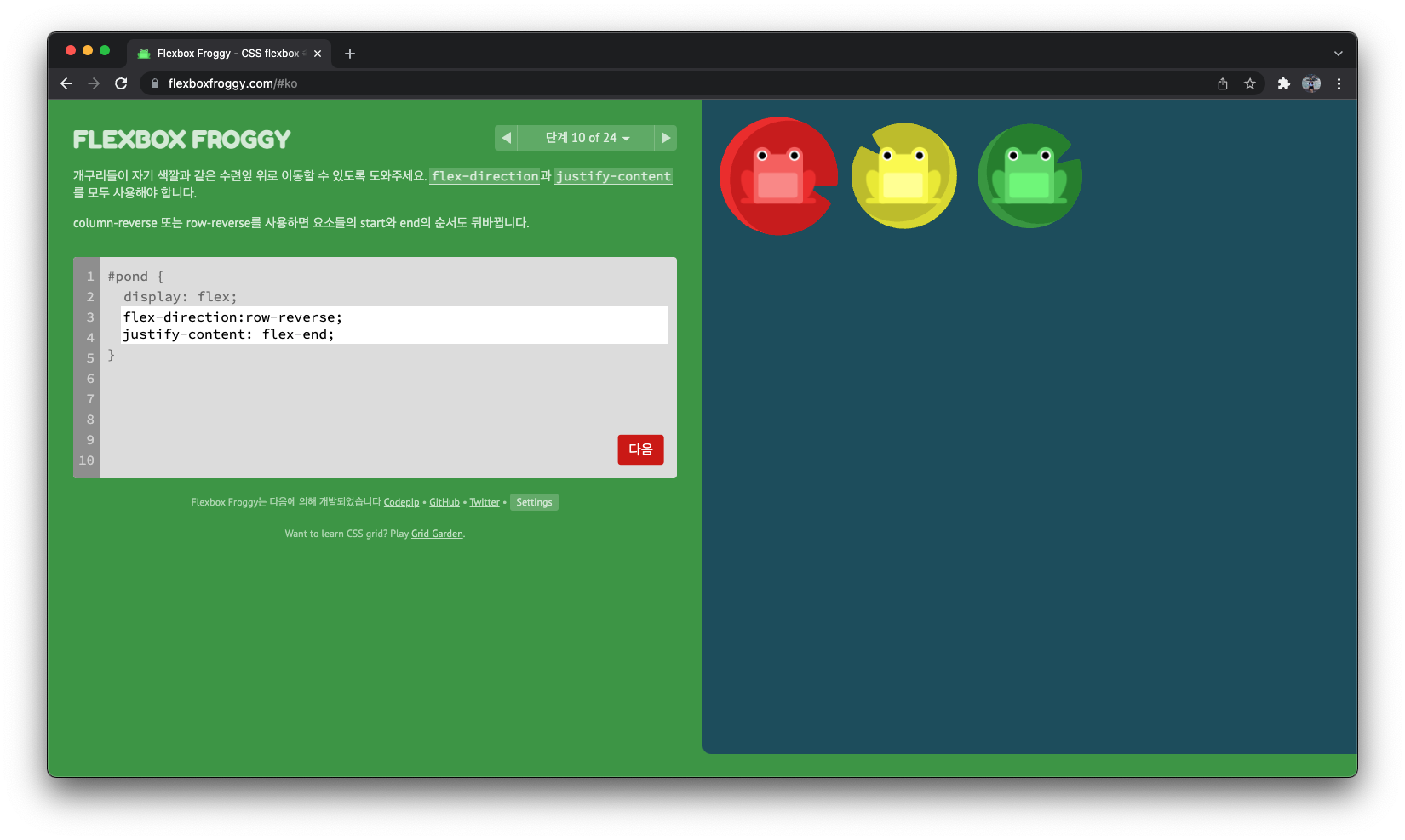
flex-direction:row-reverse;
justify-content: flex-end;
단계 11
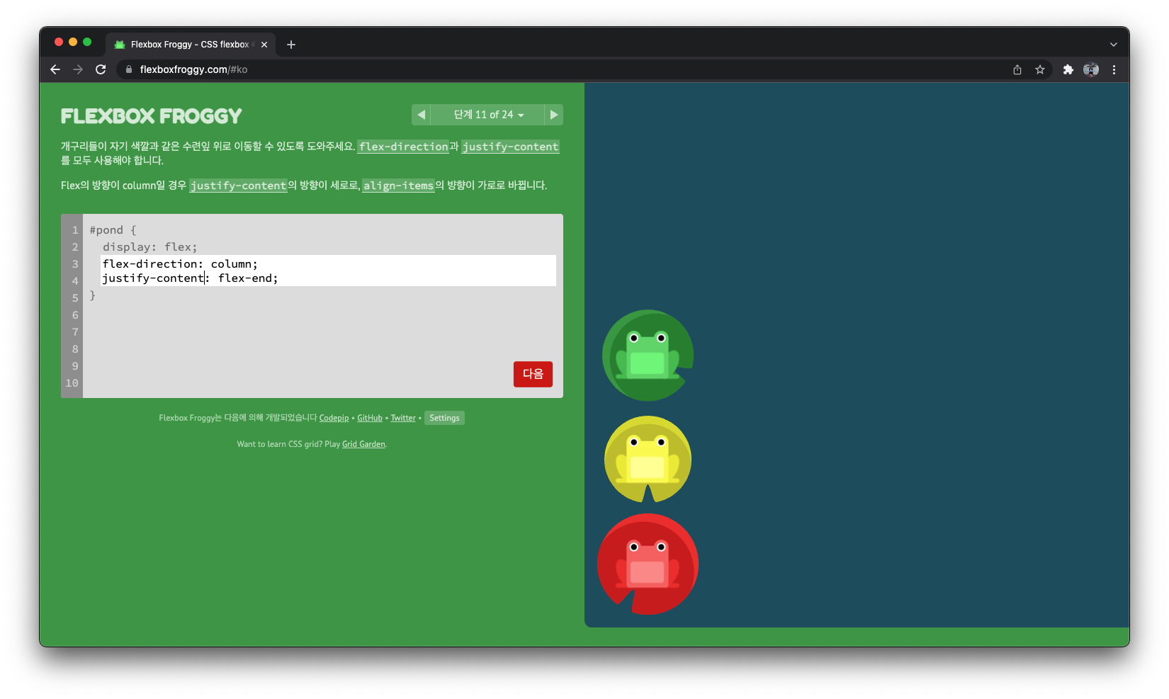
flex-direction: column;
justify-content: flex-end;
단계 12
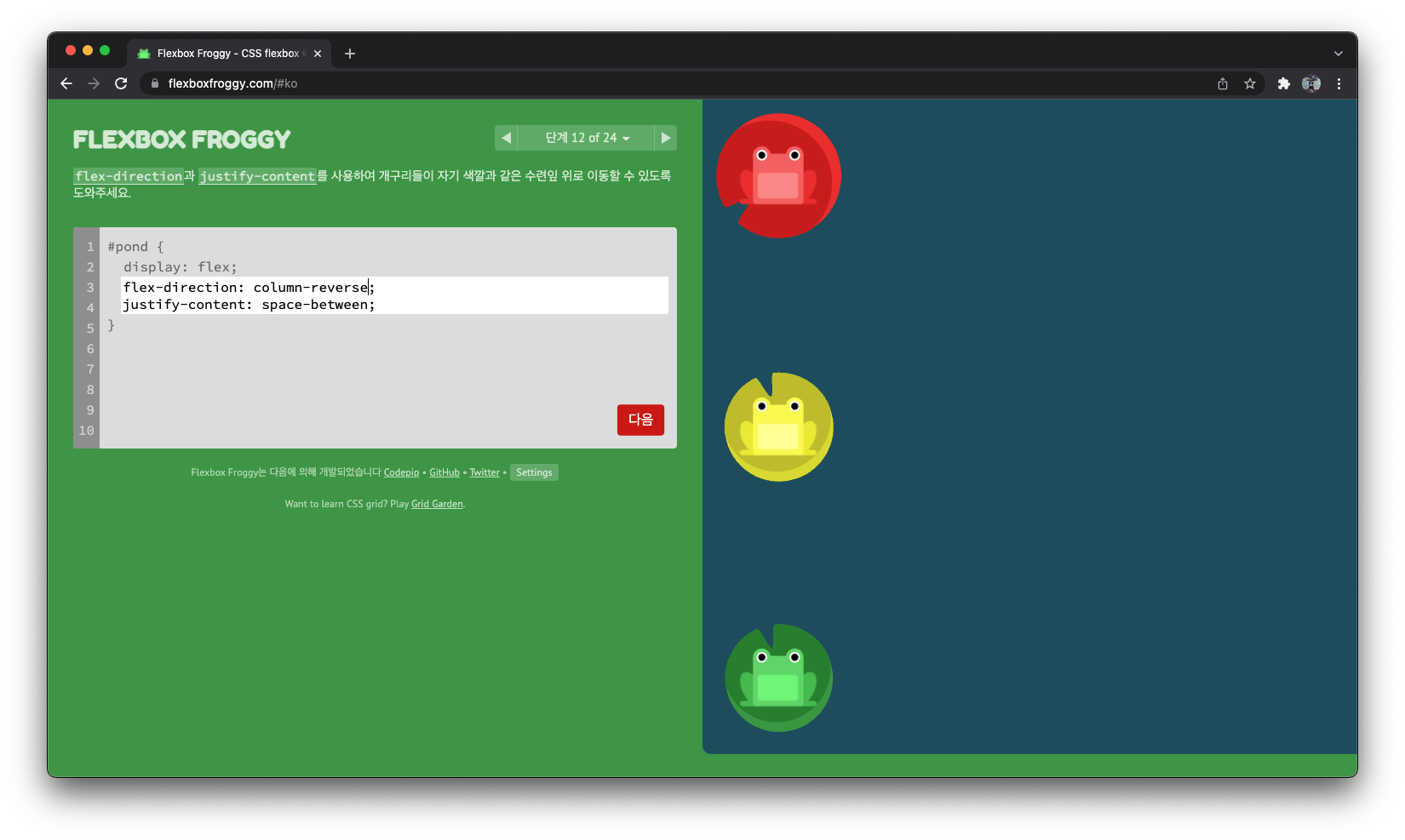
flex-direction: column-reverse;
justify-content: space-between;
단계 13
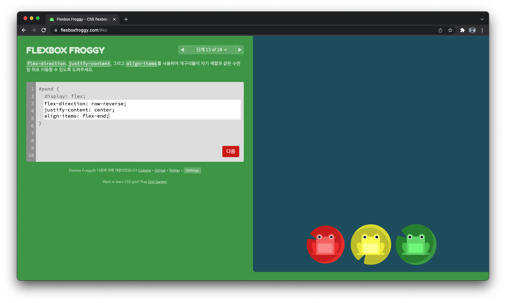
flex-direction: row-reverse;
justify-content: center;
align-items: flex-end;
단계 14
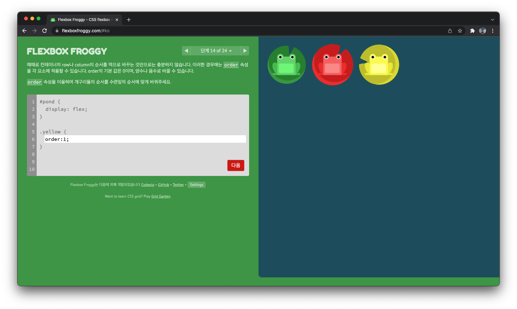
order:1;
단계 15
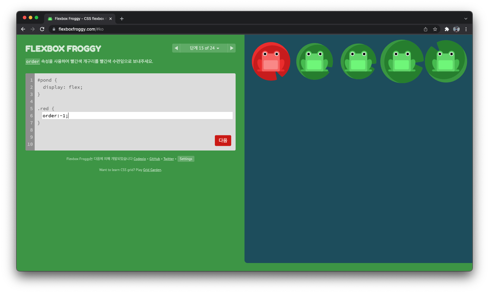
order:-1;
단계 16
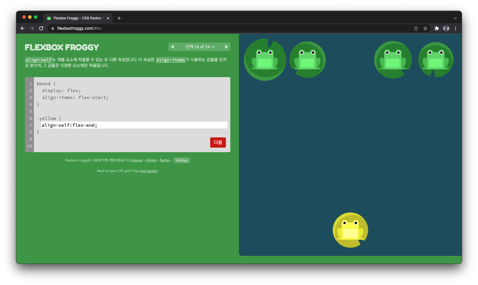
align-self:flex-end;
단계 17
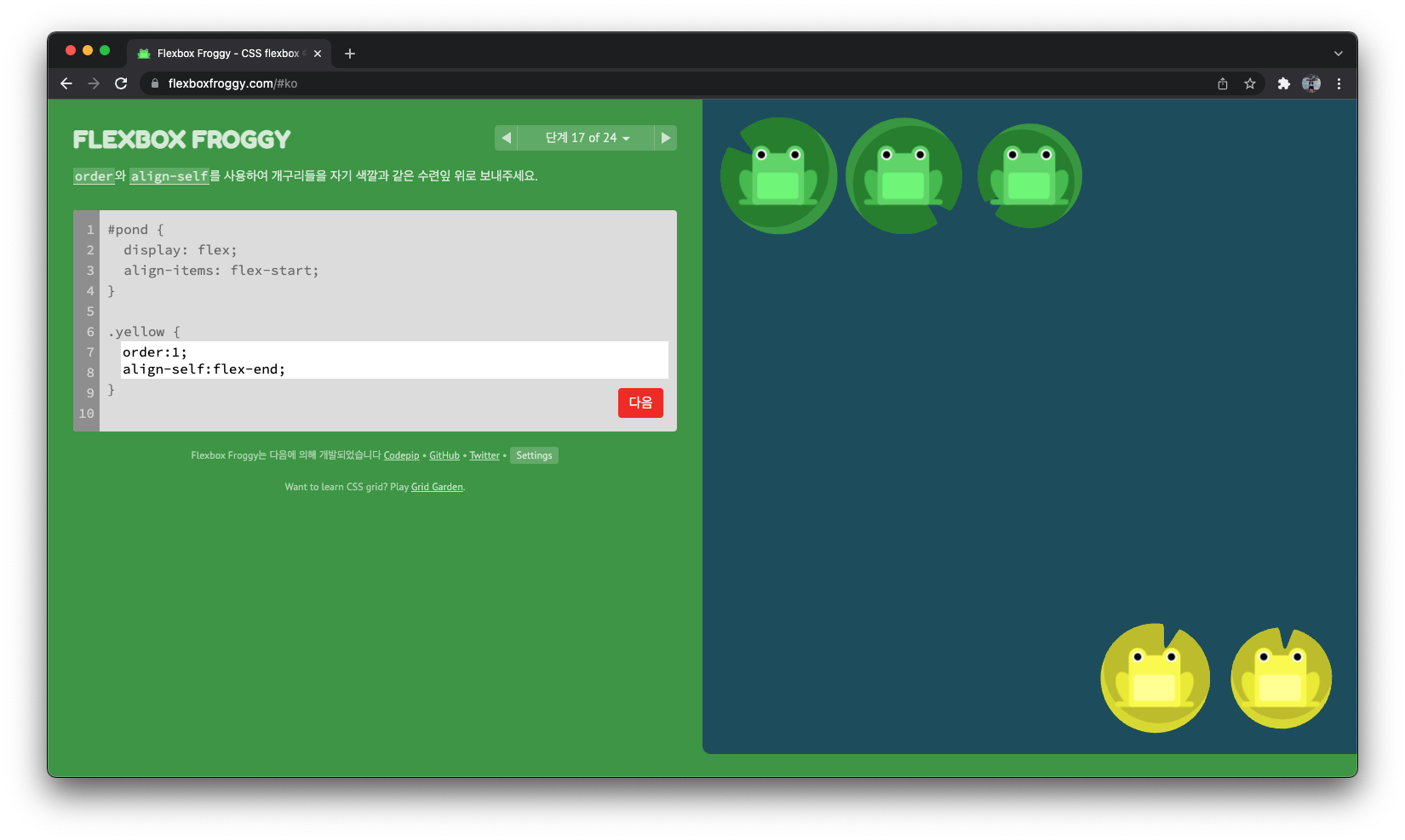
order:1;
align-self:flex-end;
단계 18
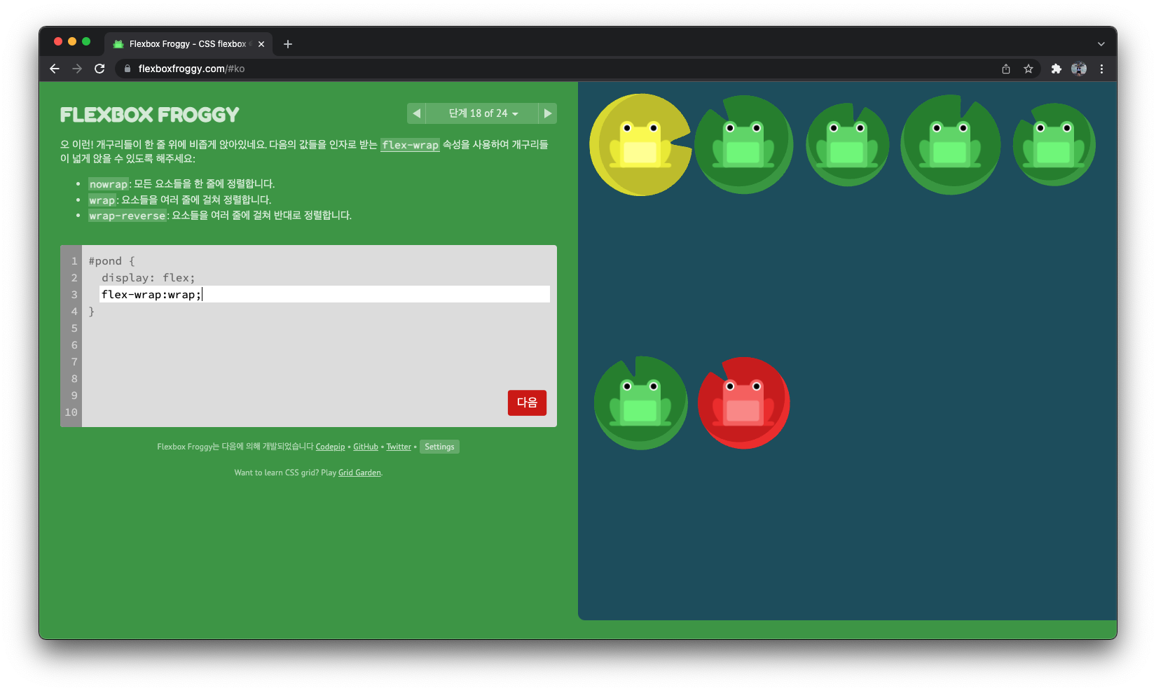
flex-wrap:wrap;
단계 19
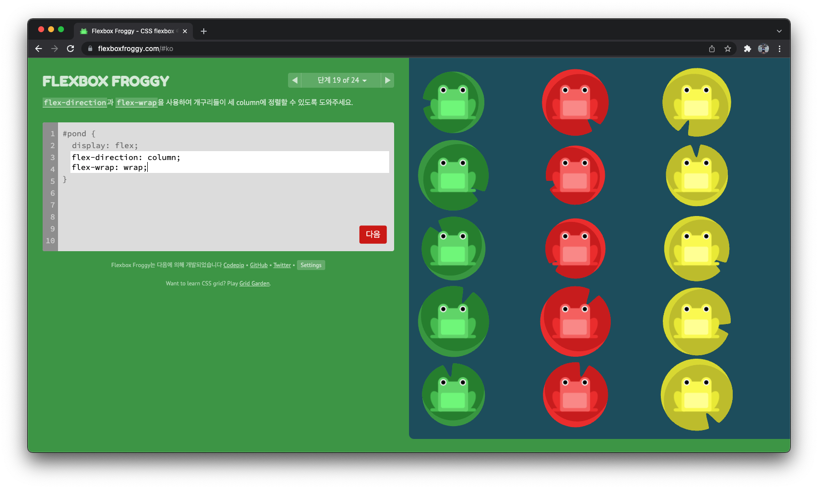
flex-direction: column;
flex-wrap: wrap;
단계 20
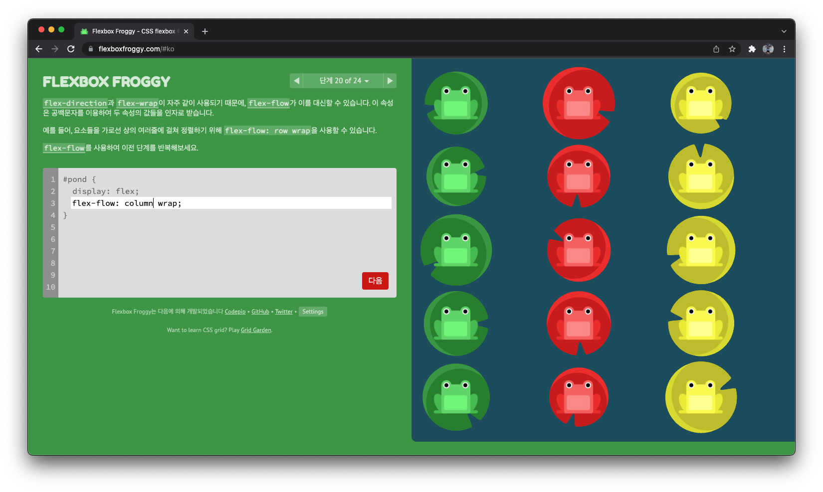
flex-flow: wrap column;
단계 21
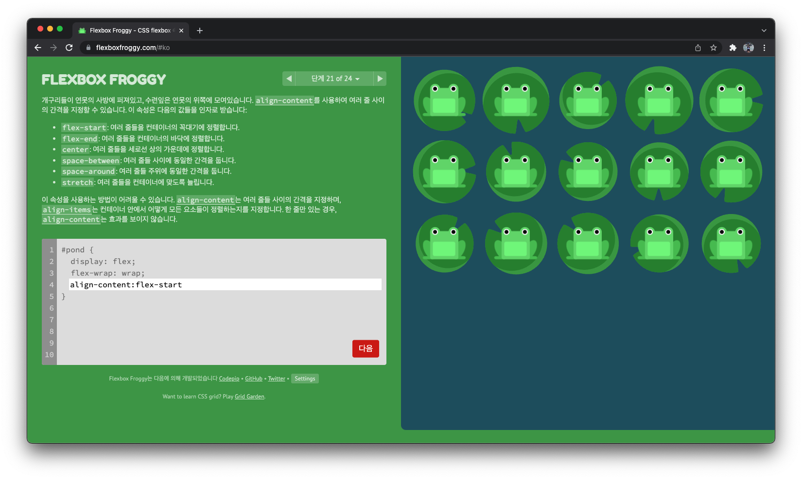
align-content:flex-start
단계 22
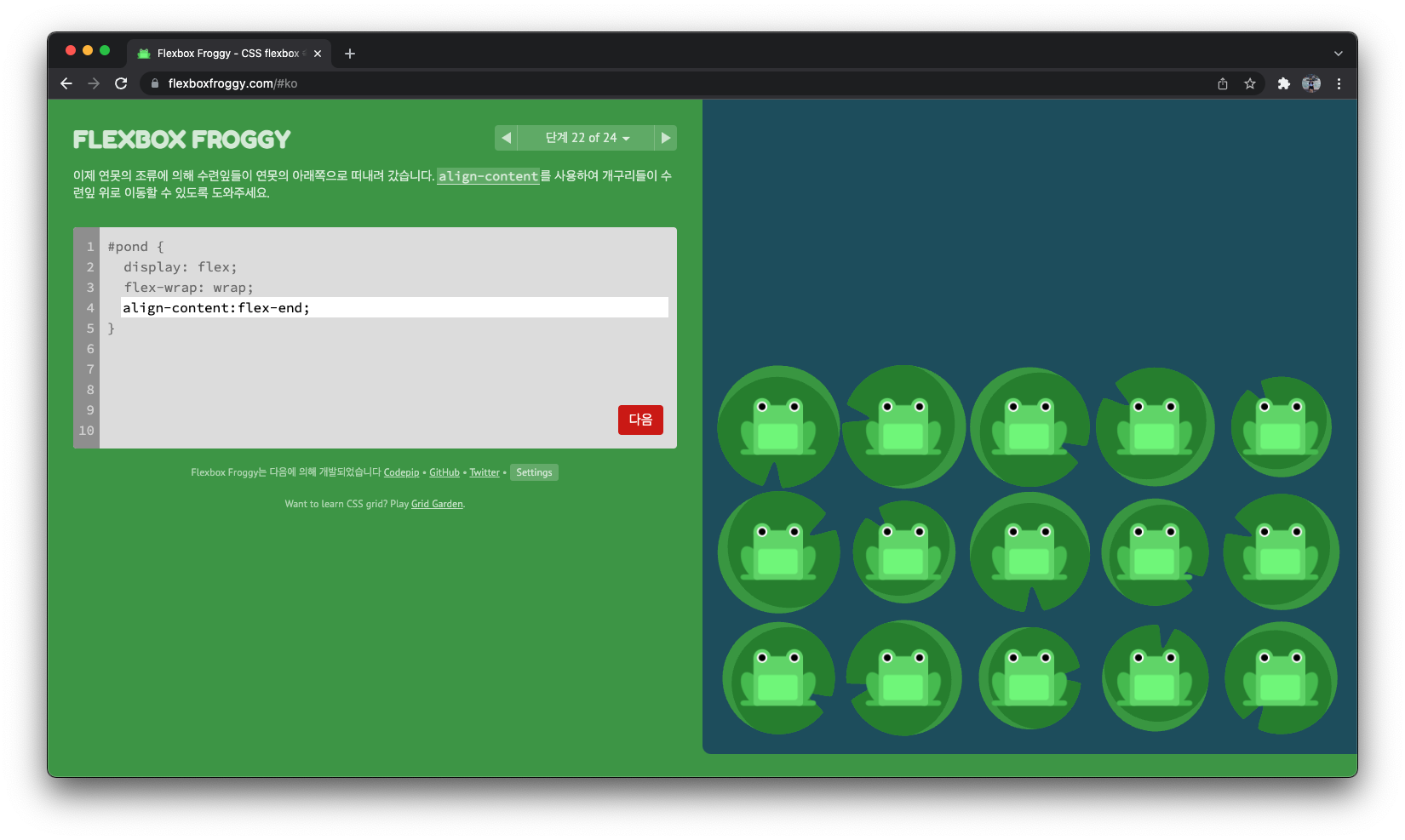
align-content:flex-end;
단계 23
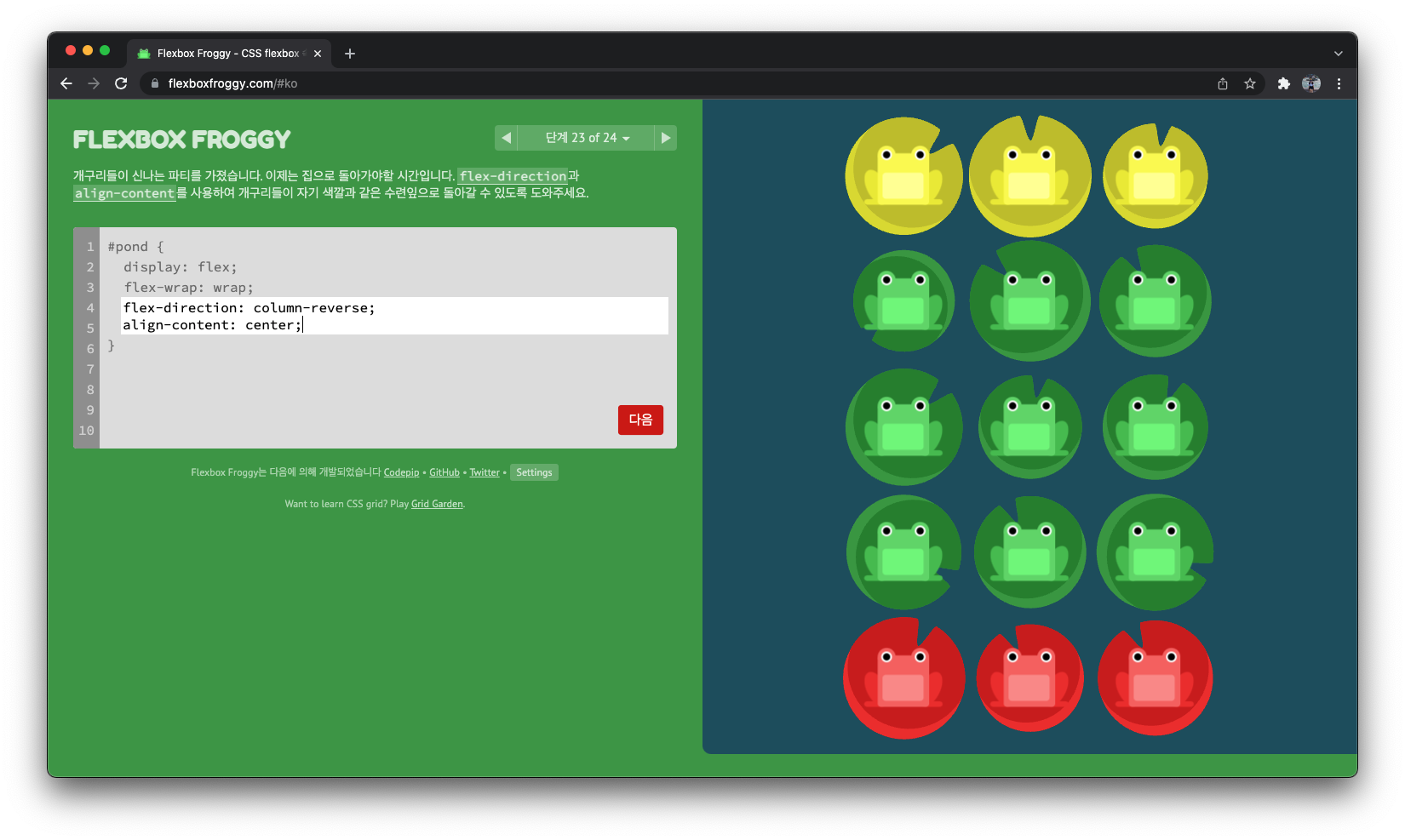
flex-direction: column-reverse;
align-content: center;
단계 24
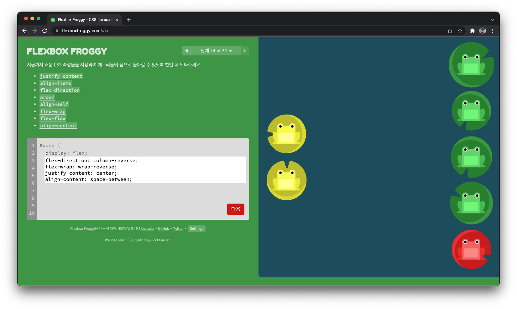
flex-direction: column-reverse;
flex-wrap: wrap-reverse;
justify-content: center;
align-content: space-between;
반응형
'CSS > Flexbox & Grid' 카테고리의 다른 글
| [CSS_Flexbox] align-items, align-self, align-content 차이점 (0) | 2022.01.10 |
|---|---|
| [CSS] - Flexbox 기본 개념 총정리 (0) | 2022.01.10 |
'CSS/Flexbox & Grid' Related Articles
more


Comments